Kroo Rebrand
Context
Designing a bank the planet needs
I joined Kroo Bank as employee #8 and designer #1. Over my 4 years at Kroo, we took an idea of ‘changing the relationship people have with money for good’ through to a fully regulated bank in the U.K as of June 2022.
Through launching an MVP (‘B-Social’) to test our problem/solution hypotheses, and running workshops to gain first-hand feedback from our early adopters, we gathered a wealth of insight to iterate our product before a public launch (see case study).
The more we learned about our customers, the more we knew we needed to evolve our visual identity to reflect our refined core value propositions and market positioning.
This built the momentum for a full re-brand, from B-Social to Kroo.
My contribution
Branding, Visual Identity, Research, Prototyping, Usability Testing
1x Product Manager
1x Product Designers
6x Engineers
The team
Tools
Figma, Adobe Suite, Usertesting platforms, Principle
The problem
Look & feel misaligned from the vision
B-Social as a brand and product began as an MVP of combining your social and financial worlds. As we further validated our product/market fit and evolved our core customer value proposition with our MVP, and began the process of becoming a fully-regulated bank, it became apparent the name, style & visual identity of B-Social were no longer reflective of the company’s mission and values.
Our black and and white palette felt flat, un-social, and was not evocative for our target audience.
And so we began the rebranding process.
How might we create a visual identity that embodies the essence of combining your financial and social worlds, and resonates with our core target market?

B-Social look & feel
The approach
Including our customers in the process
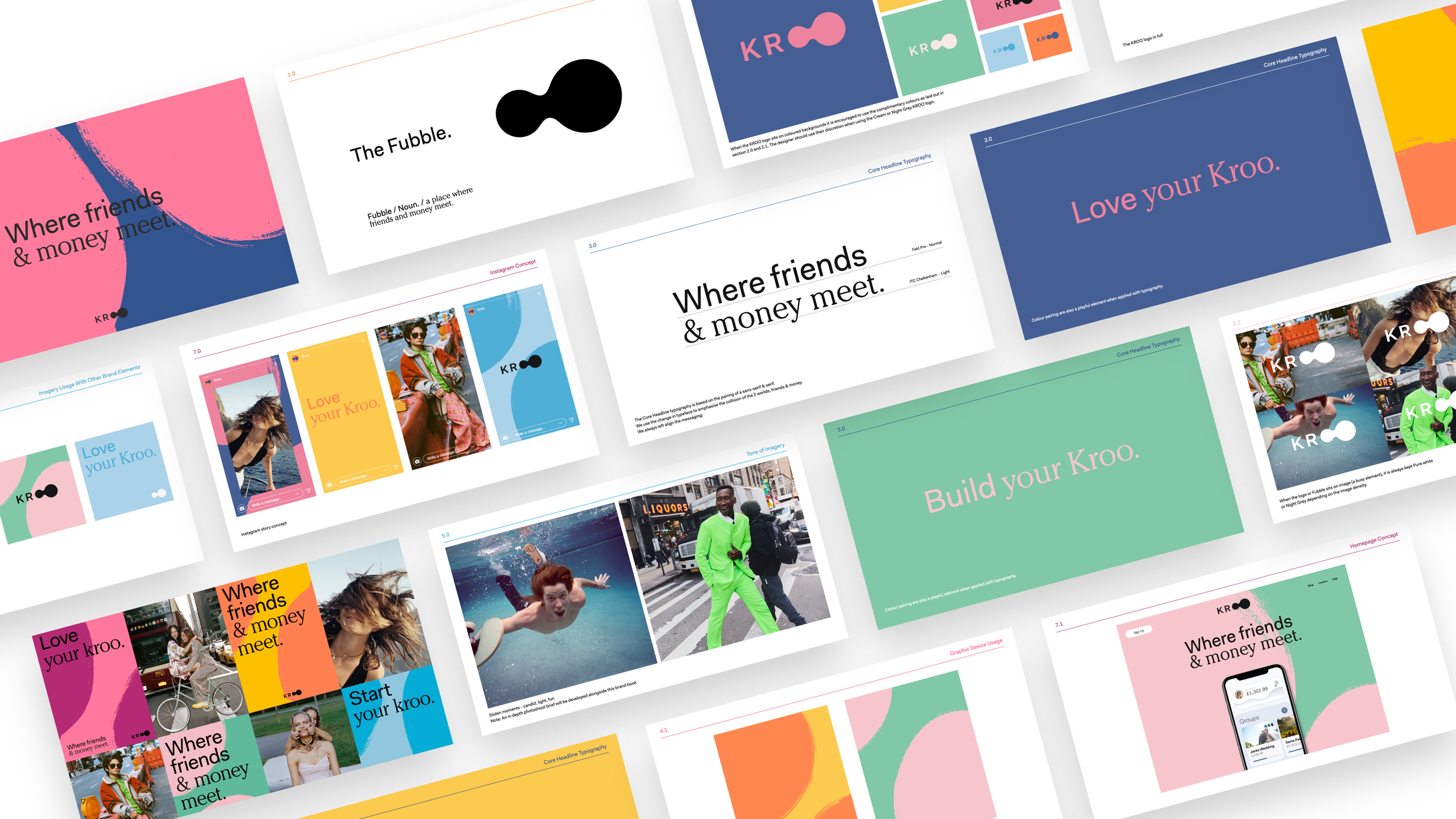
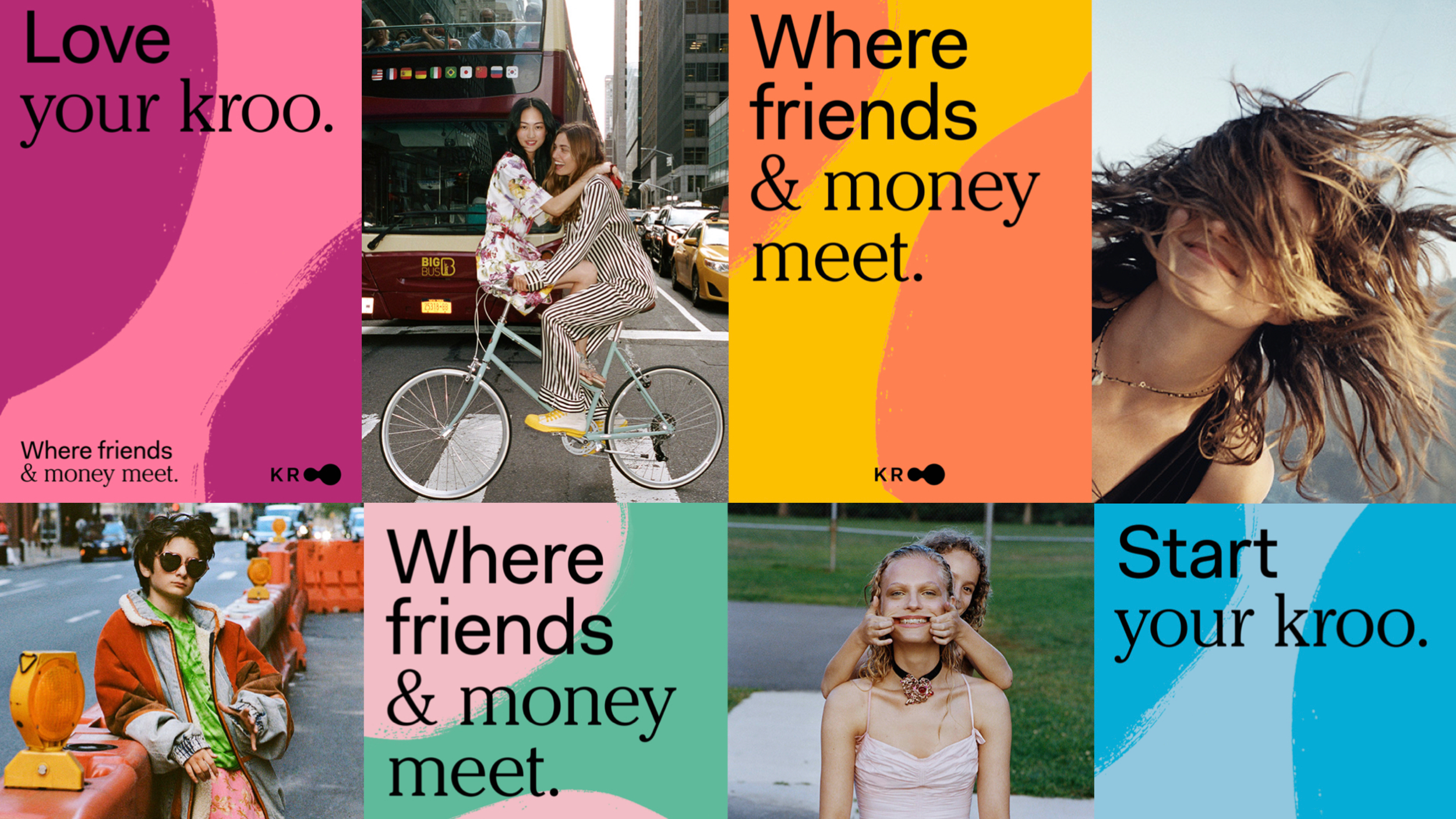
“Where friends and money meet”. The Kroo brand needed to evoke this mantra, and speak more to our core target market of 18-34 year olds. This target user group embodies an urban, socially active lifestyle, with shared finances, living together, going on holidays together, social events, sports teams.
To include our target users in our design process, we ran a series of design sessions with customers of the MVP product to get their feedback on the current look and feel, and explored what the blurring of social and financial worlds meant to them, incorporating this insight into our design vision.
The approach
What does ‘social’ banking look like?
We wanted to reimagine what banking looks like, not just in our product set, but in our visual identity. We challenged ourselves to break the perception of a traditional, outdated financial institution, and disrupt it with something fresh and exciting that would appeal to our younger audience.
This meant evolving from our MVP’s flat, stark black and white.
The approach
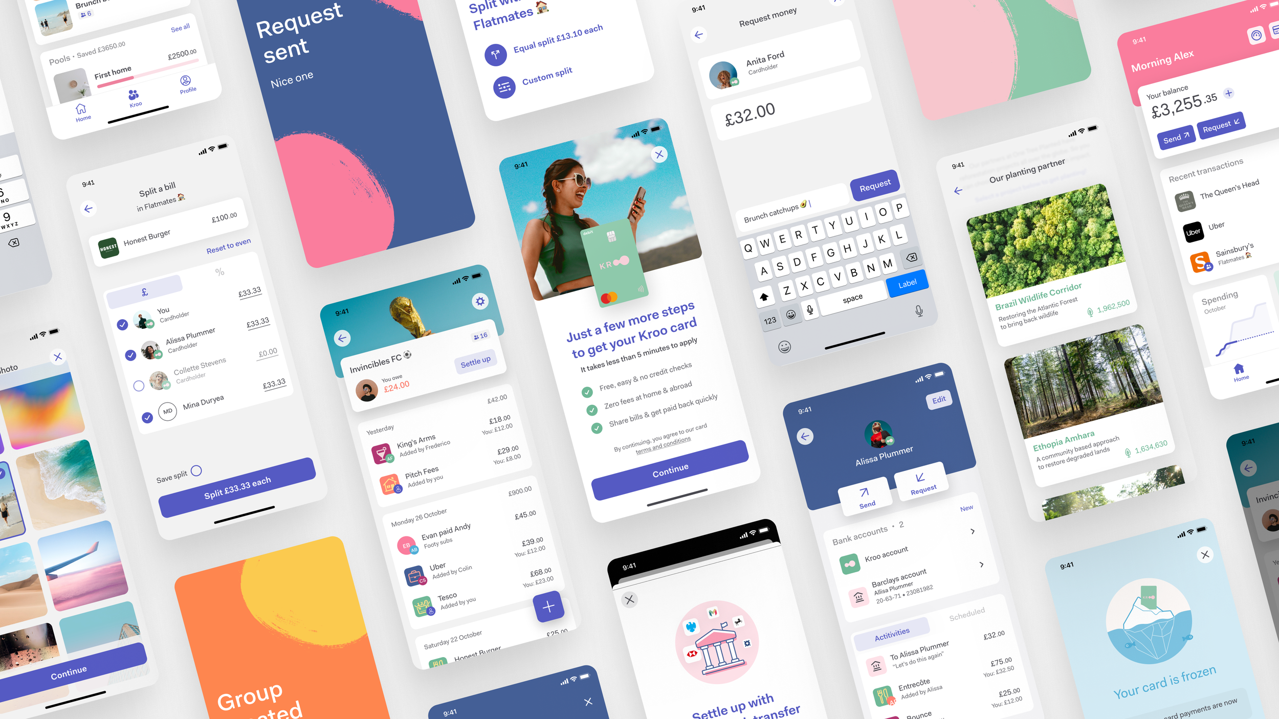
Digital first with a ‘physical’ presence
Once a regulated bank, Kroo’s product range was going to evolve beyond the current feature set not only digitally, but also physically.
I created a range of debit card designs that could be used for different types of accounts as the banking features grew, which reflected Kroo’s look and feel.
I wanted to delight the user when they received their Kroo card, with impactful postage.

The outcome
Bringing a fresh new look to the old world of banking
Make money social: gather your Kroo
As a part of our new identity, we needed a new name.
Blurring financial and social worlds
This area between the old and the new is explored with the contrasting typefaces - Cheltenham and Fakt, the yin and yang of friends and money.
Making money fun
The new Kroo experience feels more social, more alive and has a feel-good factor about it. Money doesn’t have to be a dull topic. It can be youthful. This is achieved with lighter, bold colours, and a high-impact photography style that works alongside the colour palette.